Introduction
The classical definition of visualization is “the formation of visual images, the process of interpretation in visual terms, or introduction into visual form”. Due to the process of digitization, the definition has been expanded to also mean “a tool or method for interpreting the data loaded into a computer” and “a tool or method for creating images from complex multidimensional datasets”. The purpose of data visualization is to obtain information by mapping data to graphical objects. Let’s look at some techniques and tools for Big Data visualization.
Big Data Visualization Dashboards
One of the main goals of big data visualization is to create dashboards for the most efficient information analysis.
What is a data visualization dashboard? It is a dedicated tool that helps you track and analyze key indicators such as KPIs, different types of metrics, and the data you need to focus on at the moment. This kind of tool is easy to understand, so even the people who do not have a technical background can freely use it to make informed decisions. These visualization dashboards can present data in various forms such as charts, tables, maps, etc. The form depends on the type of data being analyzed.
Advantages
What are the business advantages of using data visualization dashboards?
All metrics in one place
Different businesses use many different tools to track metrics, and it can take a long time to analyze data from different sources. Using data visualization dashboards allows you to collect all information in one place, which saves time and allows you to see the whole picture.
As we said, people with no technical background or experience in data science can successfully use data visualization dashboards. This tool makes it easy to obtain data without the daunting need to search for information from various sources, thus helping your employees make business decisions more effectively.
Report generation
Data visualization dashboards allow you to create reports on the available information whenever you want, as dashboards update all their data in real time. The immediate availability of relevant information allows you to notice and prevent possible mistakes before they occur.
Creation of data visualization dashboards
Objectives and audience
To create data visualization dashboards, you need to clearly understand your objectives and target audience. To do this, you need to imagine the whole picture:
- Who is it for? The main goal of data visualization dashboards is to make users’ lives easier. Therefore, it is necessary to clearly understand who will use this dashboard;
- What tasks will be solved using the dashboard? You have to understand the tasks of the data visualization dashboard users. The daily tasks of different employees are strikingly different, so it is necessary to collect all the possible tasks that can be made more effective with this tool;
- What goals will be achieved? It’s important to understand the purpose of each task. That way it will be clearer which data the dashboard must collect;
- How is the information currently displayed? It is possible that at the moment all the information is collected from disparate sources, for example, Microsoft Office files or CRM systems. Creating a dashboard will allow you to visualize information in a united easy-to-read format.
Information correctness
After defining your objectives and audiences, you need to clearly understand the sources of the data. It is necessary to highlight the most useful data sources for your business. You also need to consider a data quality management (DQM) strategy. Your data must be accurate, complete, and consistent with all of your company’s goals. Automating the DQM process will be an additional step to achieving maximum productivity.
Choosing the correct chart type
It’s no secret that each chart type is responsible for displaying certain information. There is a huge variety of charts. We’ll look at some of them later in the article.
Thought-out design
Design plays an important role in the perception of a dashboard. It is necessary to choose the right colour combination, so as not to cause any eye strain when viewing the created dashboard. Consulting experienced designers can be helpful if you want to ensure that the design concept of your dashboard works well.
Choosing the chart type
There is a big variety of chart types to choose from. Each is responsible for visualising a certain kind of information. Now let’s look at some of these chart types.
Word Clouds

Text visualization is a powerful tool that can be eye-opening when one needs to quickly figure out what a particular text is saying. As a side effect, visualization also provides a mechanism for ad hoc analysis of texts. Word cloud visualization analyzes a given text and ranks its constituent words in proportion to the frequency of their occurrence in that text. Then, depending on the results of the ranking, the words are displayed in a different font; the word with the highest rank appears in the largest font in the visualization.
Charts
Line Chart
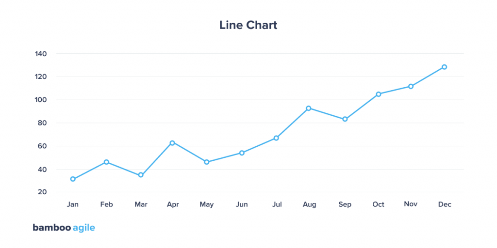
A variety of line chart types are represented in Big Data projects. They are used to display a quantitative value at a specific time interval. They are most commonly used to display trends or relationships (in case they are grouped with other lines). The line chart format does not prevent visualization specialists from finding unusual topics to visualize.
Bar Chart
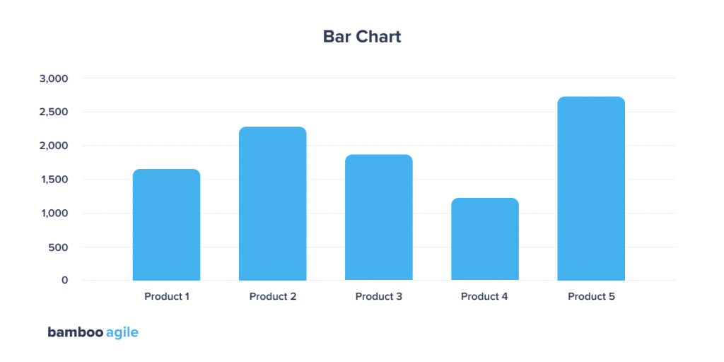
A column chart is probably the most commonly used chart type. This chart is best used for comparing different values. Users are expected to look for the specific value they’re interested in and compare it to other columns’ individual values.
With bar charts, you can compare values from different categories, or compare changes in values over a period of time within one category.
Pie and Doughnut Chart
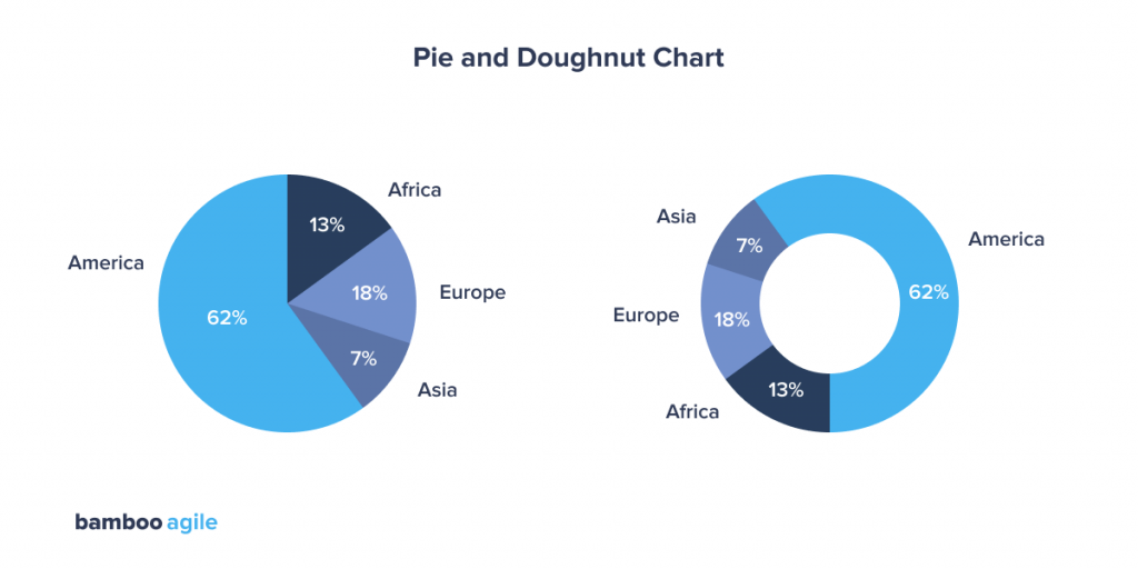
These charts are among the most commonly used – and misused – chart types. A pie chart usually represents numbers in percentages and is used to render a part or the entirety of a composition. Pie charts are not suitable for comparing individual sections to each other or representing precise values (you should use a bar chart for this).
Avoid pie charts and doughnuts whenever possible. The human mind thinks linearly, so when it comes to angles and areas, most of us cannot judge them well.
Scatterplots
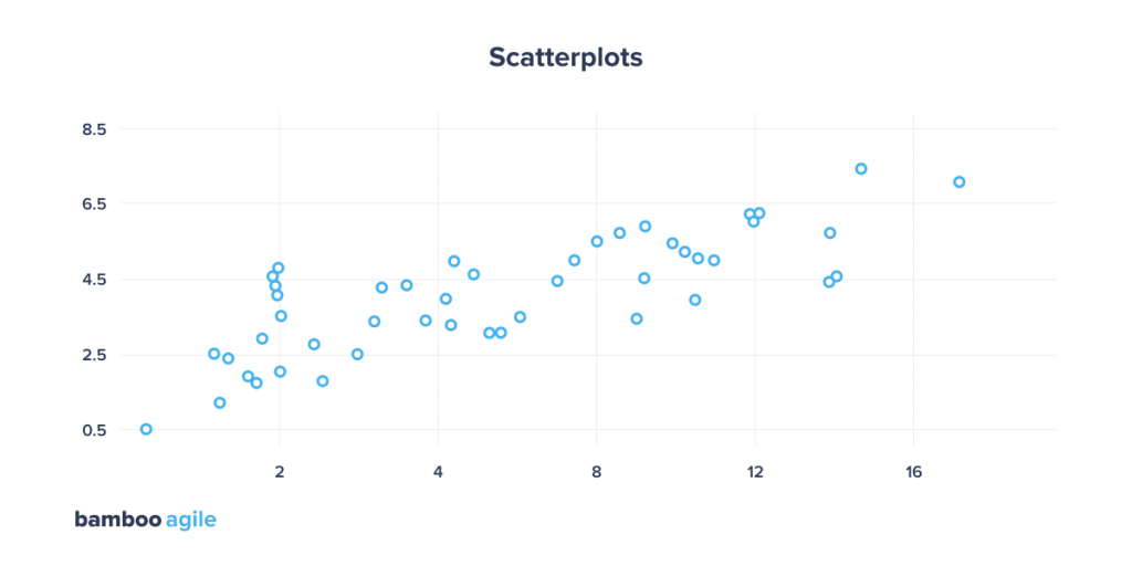
Scatterplots use a set of points placed on a coordinate axis to display the values of two variables. By plotting a variable along each axis, the graph determines if there is a relationship or correlation between the two variables. Lines or curves can be placed inside the graph to help the user analyze the data and to show the trend line a selected group of points would form.
Histogram Chart
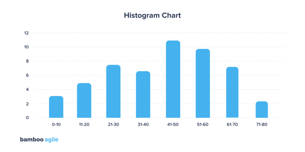
A histogram is often confused with a bar chart due to its visual similarity, but these charts still serve different purposes. A histogram shows how data is distributed over a continuous interval or a specific period of time. The vertical axis of this graph is the frequency, and the horizontal axis is the intervals or time periods.
Unlike histograms, bar charts are not associated with a continuous interval of time – instead, each bar represents a separate category. For example, it is more convenient to show the number of purchases across different years using a bar chart. If you want to know the amount of money within which most purchases are made ($ 10 – $ 100, $ 101 – $ 200, 201 – 300, etc.), it is better to choose a histogram.
Correlation Matrix
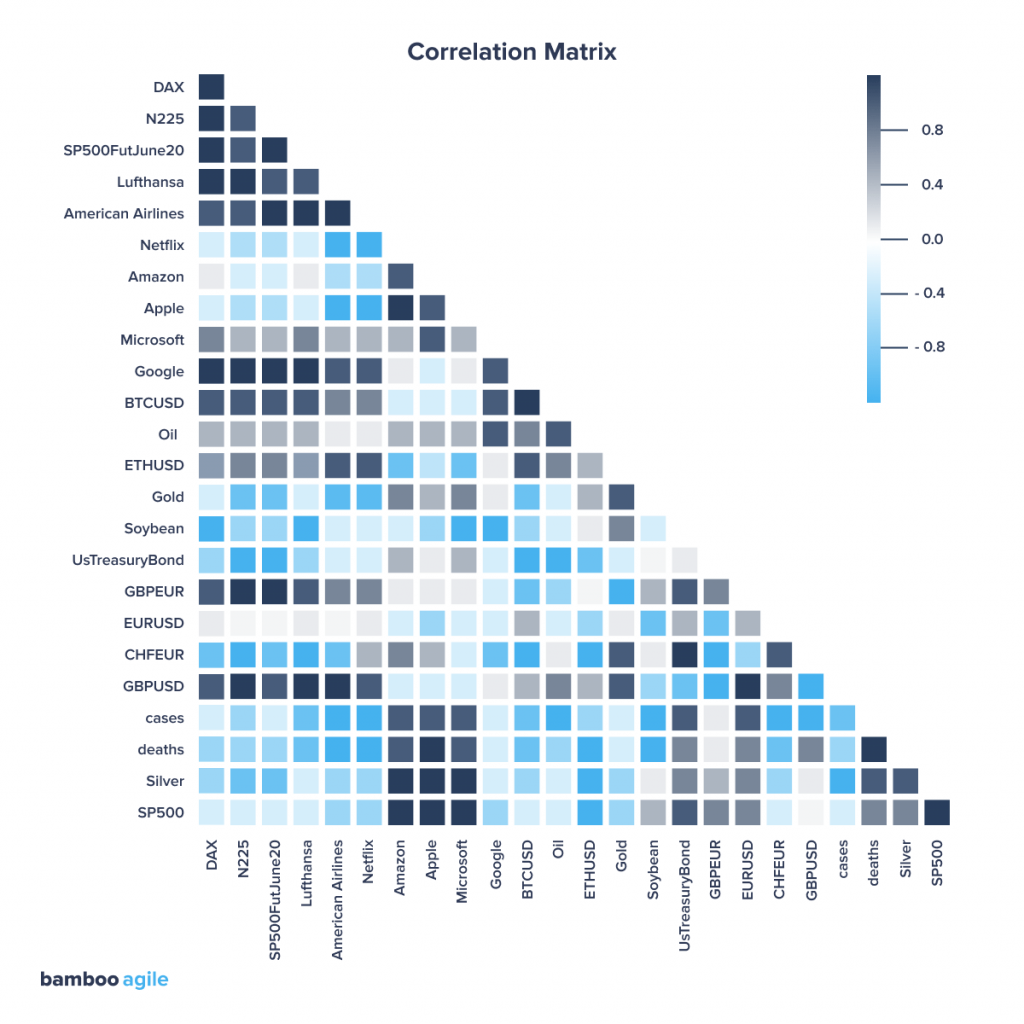
A correlation matrix is a table that shows the relationship between variables by combining Big Data and fast response times. Each cell shows the relationship between two variables. The darker the colour, the stronger the correlation and vice versa. Many visualization tools provide the ability to click or hover over a cell to learn more information.
Maps
Bubble Map
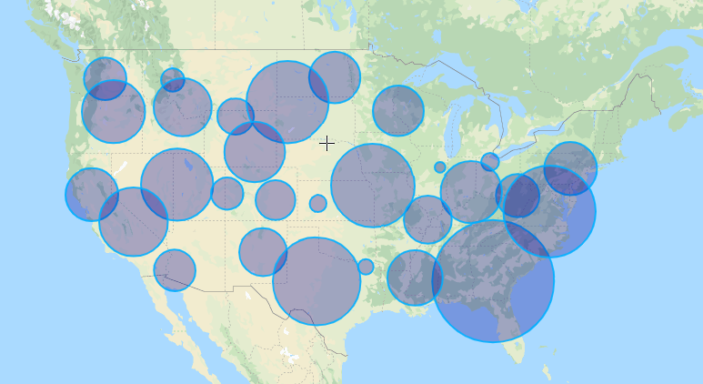
A bubble map displays circles (bubbles) in a designated geographic scope. The area of each bubble is proportional to its value in the dataset. This type of map is good for comparing proportions across geographic regions. But keep in mind that large bubbles can overlap smaller bubbles and areas.
Heat Maps
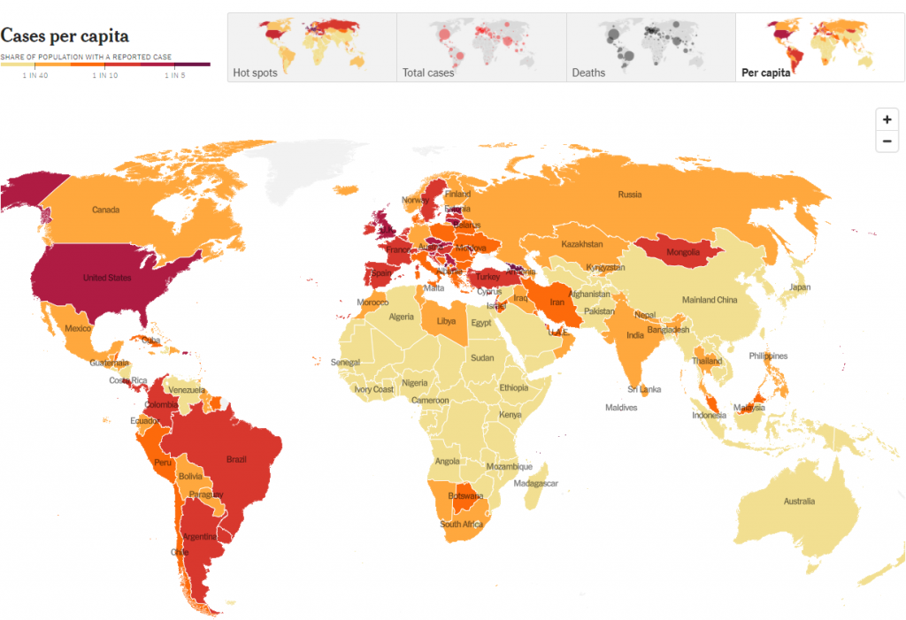
A heat map is a cartogram that shows the intensity of any point indicator within a territory on a map. Intensity is coded by colour and transparency.
Dot map
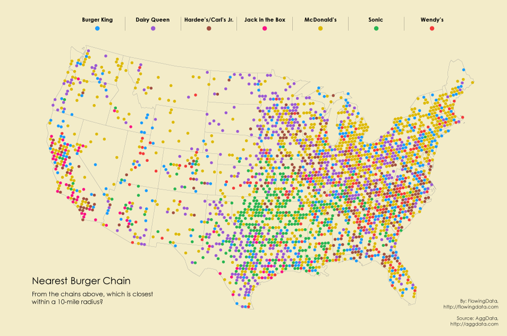
Dot maps are a way to locate and distribute data among a geographic region by placing dots of equal size across it. There are two types of dot maps: one-to-one (one point represents one object) and one-to-many (one point represents a specific block of objects). One of the advantages of displaying Big Data in this way is that, in addition to graphically displaying the total number of items, the points’ location also shows how they’re distributed. This makes them perfect for revealing certain geographic patterns.
Connection Map

Connection maps are drawn by connecting points on a map with straight or curved lines. Connection maps are suitable for displaying geographic links, and can also be used to display map routes through a single chain of links. Connection maps can also be useful for revealing spatial patterns through the distribution of connections or their concentration.
Big Data Visualization Tools
R
R is a multi-paradigm interpreted programming language for statistical data processing and graphics, developed in 1993 at the Auckland University of Technology (New Zealand). R is also the name of a free open-source computing environment designed to work with this language.
R supports a wide range of statistical and numerical methods and is constantly supplemented and expanded with packages – libraries for specific functions or special fields of application. The language is used in various applications and industries, from oil production to pharmaceuticals; it’s broadly employed as statistical software for data analysis, and has become the de-facto standard for statistical programs.
R is the perfect tool for Big Data and machine learning. Let’s say you need to quickly process data on 1000 employees or find the average grade of university graduates in 5 specialities over the past 10 years. A few instructions in the R language will perform both of these tasks in a couple of seconds. Thanks to its many statistical functions, R is great at solving classic machine learning problems:
- clustering – i.e. to divide all clients according to the level of solvency, to classify a space object as one or another category (planet, star, black hole, etc.);
- regression – a numerical forecast based on a sample of objects with different characteristics (the estimated price of an apartment, the cost of securities after half a year, the expected income of the store for the next month, the quality of wine in blind testing, etc.);
- detection of anomalies – a search for a small number of specific cases in a large sample (fraudulent activities with bank cards, for example).
R is a great tool for data visualization. R features pie and box charts, scatterplots, 2D and 3D dependencies, cumulative distribution function plots, and other more sophisticated ways to visualize data. The many built-in math functions and their implementation tools allow you to depict any relationship of different variables, for example:
- teamwork efficiency statistics;
- quarterly sales dynamics for a group of products by corporate branch;
- stock exchange quotes;
- the likelihood of a decrease or increase in demand for your services when new competitors appear.
Lots of ready-made statistical analysis functions. The creation of vectors and tables, their indexing, ranking, calculating determinants, addition and multiplication, transposition – R has functions for any matrix operations you may need. It also supports the calculation of variance, correlation and covariance, the search for identical and different elements in samples, and many other mathematical and statistical operators as part of the standard set of R libraries. If you need more complex and specific calculations, it is not at all necessary to develop them yourself – the open repository is constantly updated with free new packages that can be downloaded at any time.
R is a free Big Data and machine learning solution. Price is something that small and medium-sized companies (as well as large businesses) inevitably take into consideration. The R language is supported by many powerful graphical interfaces and IDEs that are completely free: RGui, RStudio, Eclipse, and many more. In addition, you can work with R in various text and code editors (Notepad ++, WinEdt, Kate, etc.) by connecting special packages. Neither the R language nor the graphical shells for working with it are demanding on the hardware. What’s more, both support various operating systems: Windows, macOS, and Unix-like systems: Linux, Kubuntu, etc. Thus, there are practically no technical restrictions that come with using this language.
Python
Despite the fact that Python is considered a universal programming language that is used for web development and the creation of specialized solutions, it has gained most of its popularity in the field of Big Data and Data Science. That’s due to the following key advantages:
- low entry threshold due to the simplicity and conciseness of even the most complex logical structures. This programming language is many times simpler than Java and Scala, and similar code on it will be much shorter;
- many ready-made libraries for machine learning and other methods of artificial intelligence, statistical computing, and data mining: TensorFlow, PyTorch, SKlearn, Matplotlib, Scipy, Pandas, etc.;
- the availability of API in most frameworks for processing and storing Big Data, for example, Apache Kafka, Spark, Hadoop, etc., which simplifies the work of Big Data solution programmers and data engineers. We will talk about this in more detail later.
So, thanks to the above advantages, this programming language is necessary for almost every Big Data specialist. But there are a couple of other factors:
- This programming language can solve almost all Data Science-related tasks, from preparing a dataset for analysis to interpreting the results of ML-modeling;
- The data analyst has the ability to quickly analyze large volumes of “raw” information using special libraries and commands, for example, to exclude duplicate values in an array or to identify trends;
- The data engineer provides the analyst and the Data Scientist with data, organizing the pipelines for collecting, transmitting, and processing information (data pipelines). In fact, you can write your own data producer for Apache Kafka using the KafkaProducer API, create a script for a streaming distributed data processor in Apache Spark on PySpark, or read data from Hadoop HDFS using PyArrow;
- The developer of distributed applications and other Big Data solutions organizes the integration of data and systems using the API (sending logs from Apache Kafka to NoSQL-DBMS Cassandra via a Python application, for example).
- A cloud or an on-premises cluster administrator can authenticate Data Lake end-users based on one or more factors using Python applications. Similarly, authentication between different services is possible, i.e. in Azure Data Lake Storage.
All these nuances are discussed in the “School of Big Data” courses on the administration and development of Big Data solutions. However, most of our courses are aimed at experienced professionals. It is quite difficult to master all these curricula without the knowledge of statistics, Data Mining techniques, and programming skills in the Python, Java, or Scala languages.
Tableau
Tableau is a system that allows you to conduct a deep and comprehensive analysis of information, and then present the result in an interactive form. It collects large amounts of data from various sources and displays the information on the dashboard in real time. Furthermore, it is a very flexible, fast, and easy-to-learn platform.
Its great advantage is the ability to combine data from different sources and databases. It also allows several users to work on a report at the same time. You can share the result by link, mail, or through the Tableau server.
The platform can use the following data sources:
- Cloud systems: Google BigQuery, Windows Azure, etc.;
- Relational systems: SQL Server, DB2, Oracle, etc.;
- File systems: Excel, CSV, etc.;
- Any other sources that use a programming interface to access databases.
Key features:
- Users can create their own dashboard and analytics tools;
- The system works with all devices with data streams – no need to worry about hardware or software requirements;
- Information panels have access to data storages: SSAS Multidimensional Cubes and DWH / DataWareHouse;
- Business users can make applications for creating dashboards themselves;
- Several users can work on a report at once.
Distinctive features:
- Any report is created in several steps;
- Users have access to ready-made industry solutions;
- The system is installed in a few minutes and does not require expensive implementation;
- The platform processes data of any format;
- Users can create reports of any complexity – from simple ones to those that deal with trend analysis;
- The service is fast and has a clear interface;
- The program filters and sorts the incoming information online.
Conclusion
Big Data can be a very powerful and helpful tool in the right hands. But a lot depends on the tools used to visualize that information. In this article, we’ve described common visualization techniques and technologies. Of course, there are a lot more different ways of Big Data visualization. To find the one that will perfectly suit your needs, consider discussing the issue with a team of professionals. Contact the experienced Bamboo Agile team for a free consultation and get ready to see outstanding results!


