The Bamboo Agile crew is no stranger to web application design. With us having built dozens of successful websites, it’s safe to say that we have somewhat of an understanding of what works well and what really doesn’t. That being said, we gain plenty of knowledge with every new project; a great example would be our recent gig, which has turned out to be a pretty fascinating website makeover experiment.
How we got involved
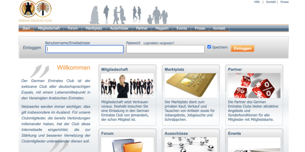
It all began with an RFP: German Emirates Club, a huge community in the UAE, wanted a website makeover. We took a look at what we had to work with, and were met with a fairly standard community platform, which provided some information on the company, general news, event announcements, and other sorts of relevant data. Problem was, it wasn’t laid out in the most intuitive way. Most web designers know that in order to keep engagement high, the information has to be expertly organized and served in a digestible, attractive package. What we needed to do was give the UI a substantial overhaul, making it a lot more professional, usable, and inviting.
So, Bamboo Agile assembled a team of one project manager and two UX/UI designers. We had 2 weeks to develop the new interface, meaning there was absolutely no time to lose.
But before starting, we had to set several things straight. First of all, what did the GEC company stand for? From what we’d gathered, the main aim was to provide the growing German community of the UAE with a substantial, high-quality platform, promoting cooperation and helping its members adjust to an unfamiliar environment. Therefore, the website itself had to be welcoming, clean, and easy on the eyes. People did come there in search of assurance, and being met with a light, the familiar design would help a lot in making those visitors feel at ease. At the very least, neater aesthetics would build an impression of a business that knows what it’s doing. Having made our goals for the project clear, we got to work.
Solving the same issues differently
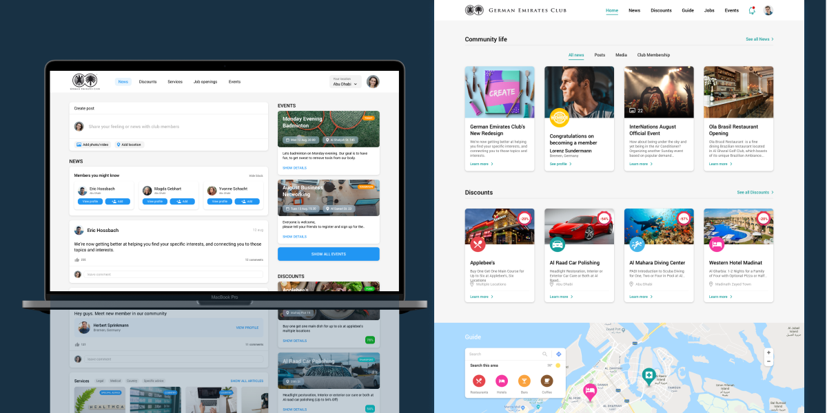
Several days passed, and our team was ready to present two different mockups of the website’s new interface.
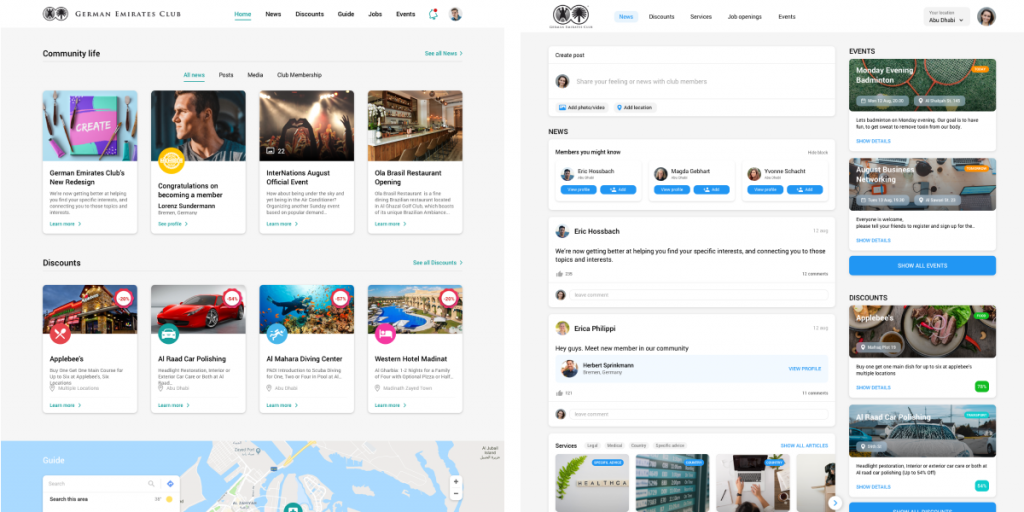
Website Revamping Concept #1
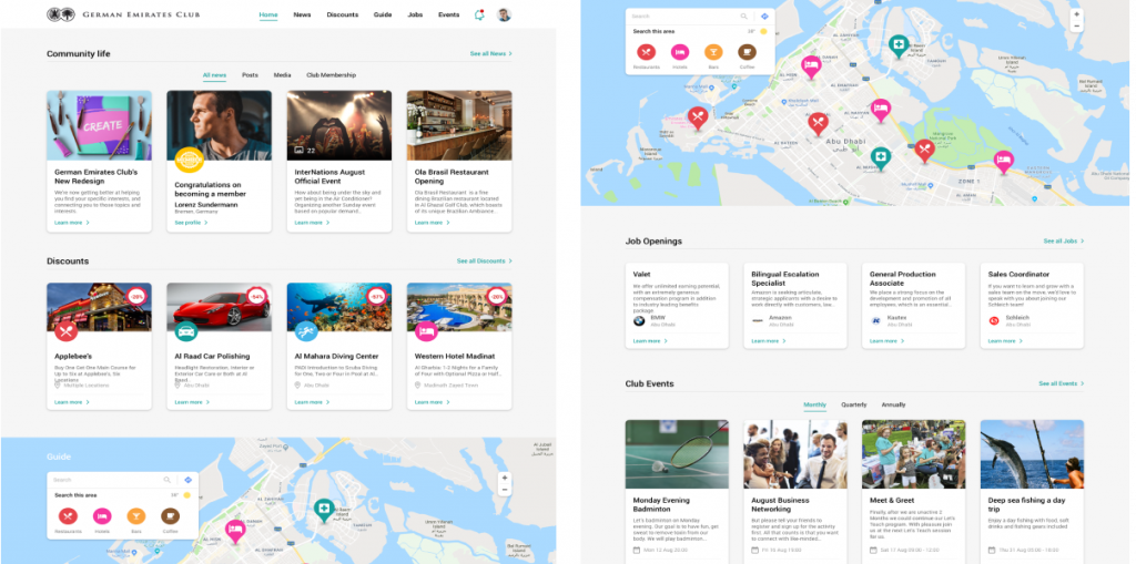
The main focus of the first version was dividing the main menu into blocks: community, discounts, guides, job openings, and so on. Those could be accessed either by scrolling down the website’s main page or by selecting the respective section in the header, which was made smaller, but much more distinct, with a plain black version of the company’s logo standing out beautifully against the pristine white background. It’s worth mentioning that the original header followed a somewhat similar design philosophy, however, the contrast was not nearly as stark, and the logo itself – while fine for its time – looked slightly outdated.
We’d also reworked the guide part of the website to feature a big interactive map, making it more colourful and easy to use. What’s more, we’d implemented some social media-like features, such as simple profile customisation and instant notifications.
Website Revamping Concept #2
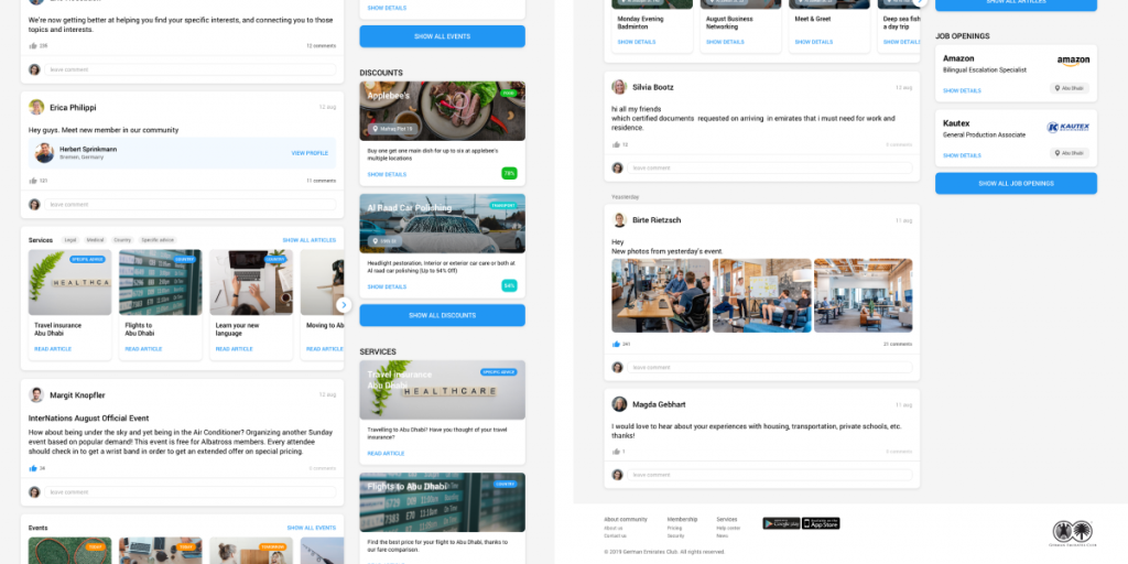
The second mockup leaned heavily into social media-inspired UI. There, the facebook-like timeline took the center stage, while the above mentioned blocks were moved to the far right.
The header was redesigned in a similar fashion, with a tab showing your current location. The footer featured the same company logo, as well as some extra links, including those leading to GEC Android and iOS mobile applications. The first mockup’s footer had almost identical functionality, but it’s important to note that the original was, in comparison, very lacking.
Results
In general, both redesigns boasted a much cleaner palette and friendly, usable, uncluttered layouts.
Overall, we were very proud of the results. Comparing our mockups to the original GEC page was like looking at two completely different internet eras. While the initial site was competently made, it absolutely needed a breath of fresh air – both in terms of its function and its visuals. That new look couldn’t come at the cost of the company’s identity, however. Trying to senselessly cram every current trend onto a fairly conservative page is a recipe for something that in no way represents the business at hand.
The redesigns made by the Bamboo Agile team combined the core essence of the GEC brand with novel, carefully applied state-of-the-art web design sensibilities. Each added feature served a purpose, each element built on the business’ key principles and goals: providing long-term social support and creating a safe and secure online environment for the German community in the UAE. Finding that balance between old and new was by no means an easy task – it never is. Even so, we’ve managed to achieve exactly what we’d set out to do: enhance the good, remove the bad, and bring the GEC company’s online image into a new age.
How much does it cost to redesign a website?
Much like any other development service, the cost of website redesign services depends on several factors.
Firstly, it depends on who actually does the job. In case you want to do everything yourself, the cost is unlikely to go above $300 – you may even manage to do it for free. That said, it’s neither the most secure, nor the most time-effective method of going about website revamping. If you consider your skills and resources appropriate, then go for it. But if you’re not ready to invest copious amounts of time and energy into the project, you’re better off choosing a different option.
Hiring a freelancer will cost anywhere from $500 to $5,000, depending on the amount of work and their hourly rate. Granted, working with freelancers has its fair share of risks: a freelancer may not be as reliable as they claim to be, and certain projects may be too much for a single person to handle. But other than that, freelancers have a large range of prices and qualifications, and are typically very communicative.
The safest option in terms of quality is hiring a specialized development company – it is, however, priced accordingly. If you do choose to go for the tried-and-true outsourcing approach, a simple website renovation can run from $15,000 to $30,000 depending on the size of the site. Website revamping for sites with a larger page count, custom functionality, and unique business needs may cost between $40,000 and $75,000, sometimes even more than that. If one wants guaranteed results, outsourcing is the ultimate option.
It should be noted that the price heavily varies depending on the region the development company comes from. Companies from the US, the UK, Australia, and Western Europe have the highest rates on the market, while Eastern European and Indian developers offer cheaper website redesign services. Eastern European companies tend to be the most popular choice for those that want to combine expertise and reasonable pricing.
Is your website in need of an overhaul? Then consider consulting an experienced web app development team on what the most effective website renovation strategy will be. Sign up for a free consultation with industry experts from Bamboo Agile using this simple form. Let’s forge the future of your website together!
