")
Introduction
When a variety of online stores look pretty similar to each other, sometimes, an outstanding design of your e-Commerce app can become your key advantage and a powerful weapon for winning the competition.
In this article, we’ve compiled tips and trends of e-Сommerce app design that will help you take the lead in marketplaces.
E-Commerce App Design Statistics
As online shopping grows at an unprecedented rate, businesses must stay ahead of the curve by recognising the significance of e-Commerce design and its impact on consumer behaviour.
We’ve compiled some statistics to provide you with the knowledge and insights you need to enhance your online store and deliver a seamless shopping experience to your customers.
So, here are the top e-Commerce app design statistics for 2023.
- About 89% of website users switch to a competitor because of poor website UX.
- 57% of internet users said they will not suggest a company with a badly designed mobile website version.
- In 2022, the global e-Commerce market was worth US$ 16.6 trillion. Looking ahead, IMARC Group predicts that the industry will be worth $70.9 trillion by 2028, with a compound annual growth rate (CAGR) of 27.43% from 2023 to 2028.
- 70% of mobile searches lead to a shopping action within an hour, while for PCs it takes up to a month.
- Extra expenses at checkout account for 48% of cart abandonment.
Now let’s move to the e-Commerce web and mobile app design tips and trends.
App Design Tips
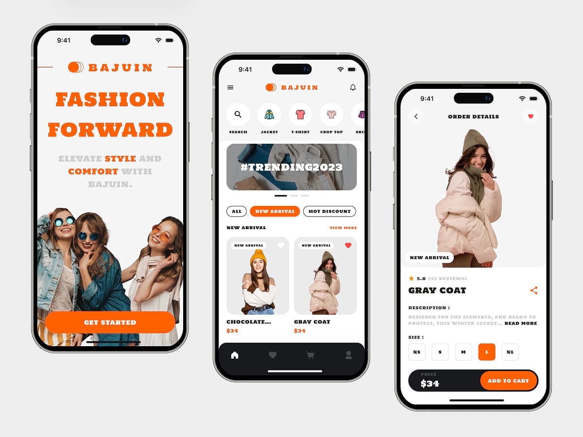
Tip 1. Fast and Smooth Registration

Create a simple and short registration form. First, we recommend asking only for the information you need most. Name, email address or phone number, and shipping address – yes. How did they know about you, the invitation code, the average user income – no.
At the signup stage, users are not yet ready to lay out all the cards on the table and entrust their personal data to you. They want to register as soon as possible to make an order. If you need to collect data for audience analysis, you can always do it later after getting their consent.
Second, all elements and buttons should be highlighted and centred to grab the user’s attention. If some fields are required and some are not, they should be marked as such.
The main rule is to focus on user-friendliness when creating an interface. The e-Commerce app design elements should suggest where to click next.
There are several types of registrations that you can use for your e-Commerce application.
- Delayed registration. Don’t ask users to share their data right away. Instead, let them browse your product catalogue freely. And only when they are ready to make an order, ask to sign in or sign up.
- Integration with social networks. The ability to log in with Google, Facebook, or Instagram makes the process faster and more natural. Statistics show that the less time users spend on registration, the more they are satisfied with the service.
- Autocomplete fields. This feature must be taken into account when developing applications for mobile. The system will prompt the user to automatically fill in contact information if they have enabled this feature in their settings.
- Guest mode. Some users do not want to create a personal account at all, so there is a solution for them too. They can make an order in guest mode and provide a minimum amount of data. But guest mode has a drawback: without a full login, customers won’t be able to view their order history or add items to their favourites.
Tip 2. The Rule of Thumb
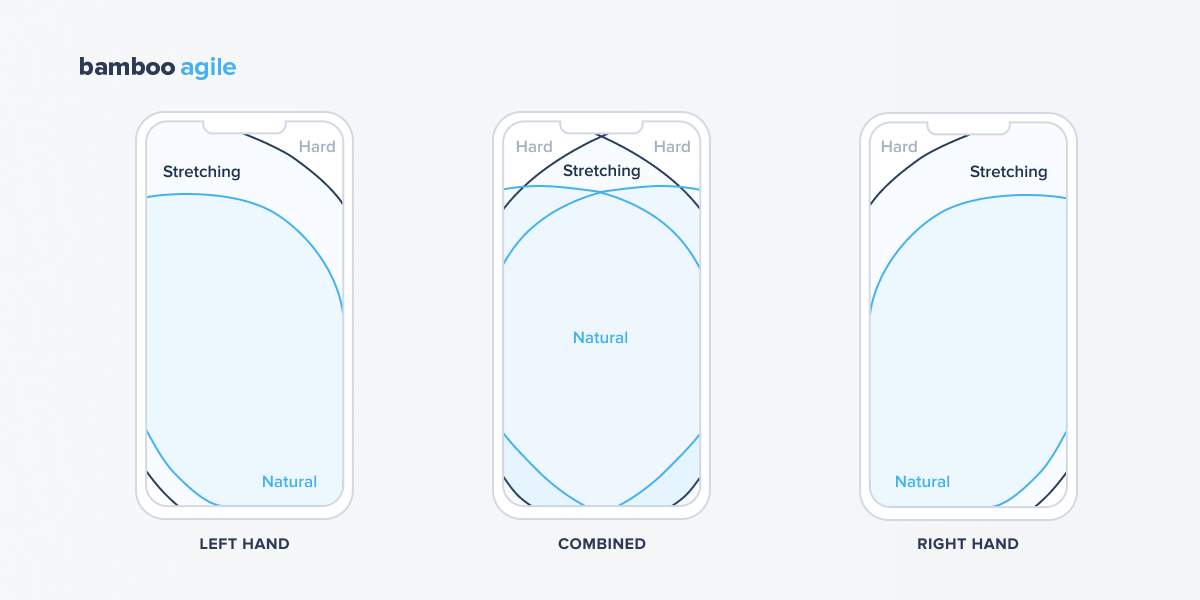
The second tip is to place all the buttons in the “thumb zone”. Want to know where it is? Just take the phone in your hand and check which corners of the display you can reach with just your thumb.
When creating technical specifications for specialists in e-Commerce mobile app design, it is important to take into account that both right-handers and left-handers will use your application.
Even though the “thumb zone” is not yet officially included in the guidelines for developers from Apple and Google, it is a bad form to create e-Commerce applications without considering it.
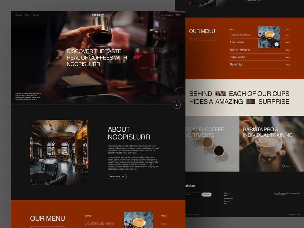
Tip 3. Smart Search
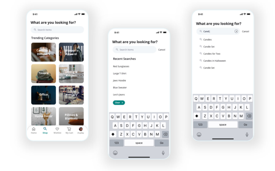
The third tip in the e-Commerce app mobile UI design is to add a smart search to your app. The less time users spend looking for the item they need, the faster they decide on purchase. Here are some smart search examples you can add to your e-Commerce app.
- By name. Users simply need to enter the name of the product in the search bar and see the results.
- By image. For example, if a user likes a product somewhere on the Internet, but doesn’t know the exact name of the product or brand, they can simply take a screenshot and use the catalogue search by image.
- Voice search. Today’s users are too busy to type, so we must enable them to use voice search.
- By barcode. This feature allows users to search for a product by its barcode number. For example, by UPC (Universal Product Code), EAN13, or ISBN for books and other printed material.
- By category. We recommend you divide all products into categories to show that you care about your users’ time. Then customers can immediately view the parts of the catalogue they need. For example, categories might include electronics, cosmetics, clothing, toys, or household goods.
The search bar should be located in the centre of the page and tell users how to search for products. Don’t forget to add filters so that products can be sorted by price, colour, brand, and more.
Also, pay attention to how your filters look. Fun page filters offer a unique twist to the regular page filtering method. They provide an individual user experience that makes your website stand out. In addition to a simple drop-down menu, unusual page filters can incorporate sliders, toggle switches, and other interactive elements. This trend also enables the introduction of more visual features such as symbols, pictures, and colour coding to assist users in quickly finding the products they want.
Tip 4. Shopping Cart

The checkout process should be as fast as registration. Usually, users won’t complete a purchase if the commissions are excessively high and the checkout is too complex. Also, make sure the customer sees the exact shipping cost before proceeding directly to payment. People also abandon checkout because shipping is too expensive (or because it is not included in the price).
Another tip: the “Checkout” or “Buy” button should be located in the “thumb zone” in the centre of the screen. Try to keep your e-Commerce app design minimal and not overload the page with elements so that the user’s attention is focused on the cost and payment.
Many companies use progressive disclosure to keep the page from looking overloaded. This design pattern allows you to organise information across multiple screens or sets. The user can simply click on the plus sign or on the Next button to get more information about the order.
Tip 5. Make a Good Shopping Experience
Making the client’s purchasing experience pleasant and hassle-free is one of the most important components of an e-Commerce application.
Reducing the number of choices is a great technique to help someone get through a procedure. When confronted with an enormous menu at a restaurant, for example, you encounter the dilemma of choice. And when customers are faced with this dilemma, they are less likely to buy anything at all. The same is true for e-Commerce apps: the number of options accessible can have both positive and negative effects on usability.
However, don’t make it too simple. Too little information can lead to people not knowing what to expect, and no choice can quickly lead to a single-option-aversion land, which no one wants to be in.
Tip 6. Maintain Design Consistency
One of the most prominent design principles is consistency. Your e-Commerce app design should be consistent in appearance and functionality. Consider the three components that come into play to support this core design principle:
- Typefaces, colour schemes, and interactive elements should look consistent across all app screens.
- Functional consistency entails interactive design features, such as buttons, working consistently across screens.
- External consistency entails having the same design patterns across all versions of the store (website, mobile app, etc.).
A consistent design allows you to establish a logical framework and prioritises information by emphasising key design features. Furthermore, consistent design makes your software predictable. Users don’t need to learn how to use your software, they intuitively understand it.
Tip 7. The Three-Tap Rule
The UX structure of an e-Commerce app should require no more than three taps to get to a product. You can achieve this by arranging your products in the following order:
Categories -> Subcategories -> Products
You can also use tags to categorise your products, such as “Bachelorette party”, “Valentine’s Day”, and so on.
App Design Trends
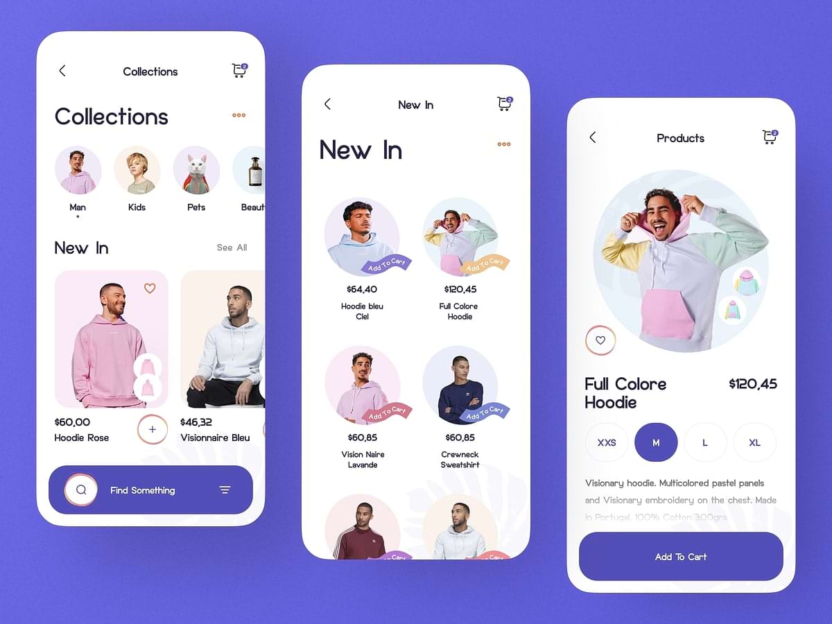
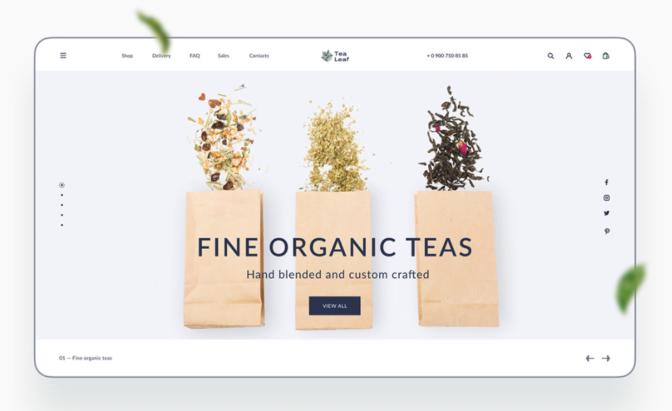
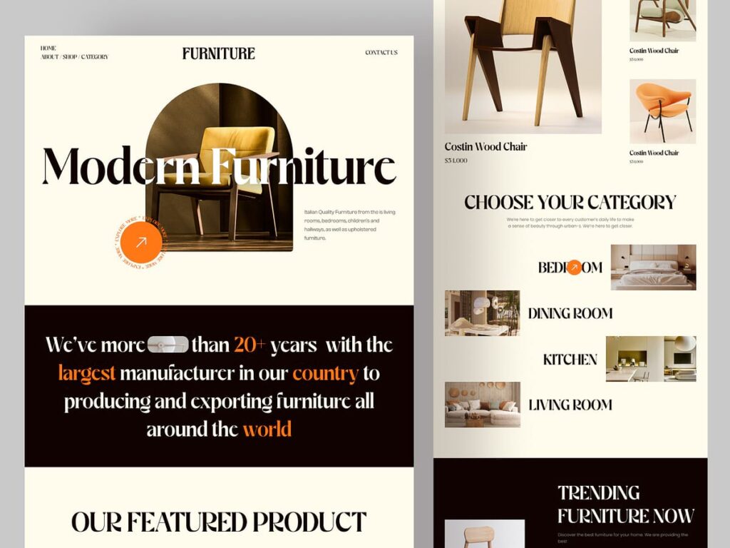
Trend 1. Minimalism and Simplicity
There have been a lot of experiments in the history of interfaces, and today design has concluded that a good interface is one that is not visible.
Why did this app design trend arise?
People spend a lot of time on large platforms and they simply do not need a flamboyant design. What online platforms must do is perform their basic functions and provide content to users. e-Commerce app design should not draw attention to itself. Therefore, plain white colour and a simplistic design is the best option to fulfil these tasks.
Modern e-Commerce app design focuses on details: interface mesh, fonts, icons, colours, UX, and animation.
What should you pay attention to?
- Keep only the most essential user functions in the foreground.
- Make the interface light and airy. Remove bright colours. Content should remain at the centre.
- Build your designs around good fonts, good layout, the right accents, icons, and consistency.
- Pay maximum attention to detail.
- Make the interface “invisible”, but intuitive and convenient.
- Do not deviate too much from the functions and designs familiar to users. Arrange your UI elements and the way users interact with them the same way large and popular companies do. It will be faster and easier for people to interact with your product because it will be understandable and familiar. For instance, do not place the notification icon in the lower-left corner of the screen, place notifications where users are used to seeing them.
How did large companies change their designs according to these app design trends?
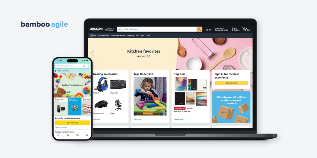
If you haven’t noticed, almost all modern sites look the same. They have removed almost all colours from the main menu and replaced them with plain black or white. Some did it earlier, others did it later. But the trend in e-Commerce app design is the same for everyone: minimalism, a minimum of accent colours, a lot of space, and content in the spotlight.
Tip: For more productive work, you can try to create layouts in black and white first and only then add colour to them. This will make it easier for you to place colour accents and will allow you to concentrate on details without being distracted by colours.
Trend 2. Pastel Colours
With the advent of minimalism and simplicity in UI design, pastel colours perfectly complement the new trend. They fit well with the concept of an unobtrusive UI, do not overload the e-Commerce app design, maintain lightness, and set the tone and atmosphere.
There is nothing difficult in implementing pastel colours: just make the backgrounds and substrates in your design as bright and transparent as possible, so that they fit well with the overall concept and graphics.
Trend 3. Personalisation
As consumers seek a more personalised purchasing experience, personalisation is becoming increasingly important in e-Commerce. Individualised suggestions based on browser history, tailored email marketing, and even individualised product pages are examples of this. Personalisation fosters a bond between the brand and the customer, which can boost loyalty and sales.
Trend 4. Augmented Reality
Augmented reality (AR) is gaining popularity in e-Commerce because it allows shoppers to see how things will look on them or in their own homes before purchasing. Furniture, home decor, accessories, and clothes can all benefit from this. It can also be utilised to provide a more interesting purchasing experience, such as virtual makeup and sunglasses try-ons.
Trend 5. Authenticity
Customers are looking for brands that are honest and transparent, therefore authenticity is becoming increasingly crucial in e-Commerce. Using real customer images, offering behind-the-scenes footage, and being upfront and honest about the brand’s beliefs and mission are all examples of this. This can help build trust and loyalty among customers.
Trend 6. Retro
Retro design features, aesthetics, and nostalgic references from previous eras have witnessed a return and assimilation into the visual and user experience of online shopping platforms. This trend tries to induce a sense of nostalgia, establish a distinct brand identity, and engage customers by appealing to their emotional attachments to the past.
Trend 7. Saturated Colours and Chunky Fonts
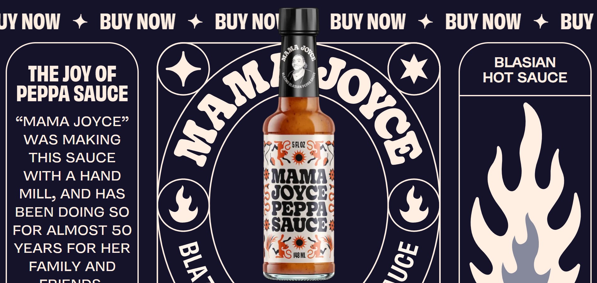
To brighten your user’s day, pair chunky, heavy-weight fonts with vivid colours. This is especially true for products aimed at Generation Z, who find hope and optimism in bright colours. When the world seems so dark at times, it’s no surprise that businesses are stepping up to provide some light to the individual.
Choosing broad and sans serif or smooth and rounded fonts not only draws users to your website and message but also gives your complete design a pleasant vibe. When used on websites and other e-Commerce platforms, chunky fonts can make your business appear more approachable or friendly. As a consequence, you obtain an aesthetic that instils positive thoughts in your customers about your business.
Your colour scheme has an effect on your thick typefaces as well. According to colour psychology, every colour can impact a person’s subconscious and change their mood. Colours can also reflect current fashion, design, and society trends. Keeping this in mind, big texts paired with bright colours like yellow, orange, or pink can elevate your chunky typography and leave a lasting impression on your clients.
Trend 8. AI and Chatbot Features

Chatbots and artificial intelligence (AI) are becoming increasingly popular in e-Commerce design. These features can assist customers in finding what they’re looking for, making tailored recommendations, and even assisting with checkout.
Chatbots can also be utilised in customer support, answering frequently asked questions and assisting consumers with problem resolution. Businesses may create a more seamless and efficient purchasing experience, improving consumer loyalty and revenue, by introducing AI and chatbots into their e-Commerce platforms.
Here are some of the benefits of using AI and chatbots on your e-Commerce website:
- Availability 24/7. Customers can get help and support from AI and chatbots 24 hours a day, seven days a week.
- Increased customer satisfaction. Based on the customer’s actions and preferences, AI technology can deliver customised recommendations and help.
- Enhanced efficiency. AI and chatbots can manage a high volume of client enquiries and requests at the same time, lowering your support team’s workload and increasing efficiency.
- Reduced costs. AI tech can minimise labour expenses associated with human support teams by automating customer care jobs.
- Data collection and analysis. AI is able to collect and analyse customer data, providing insights into customer behaviour, preferences, and pain areas.
Which e-commerce trend is a good fit for you?
Audiences want an escape in 2023. They want light and positivity sprinkled across their digital lives. As new technologies that help achieve that become more available, more brands are making use of them.
Based on e-Commerce app design trends in 2023, audiences search for an ideal version of reality when shopping online. They want a personalised shopping assistant available anytime, from the comfort of their homes. As a result, firms are ramping up their efforts.
In 2023, e-Commerce firms are going to provide users with lifelike purchasing experiences that are immersive, escapist, and rich with individuality. These brands will succeed in developing devoted customer communities to sustain their business well into the future by valuing authenticity, transparency, and innovation.
How to choose the right e-Commerce development company?
Choosing a skilled team for your e-Commerce app development is a difficult procedure. If you go about it correctly, you’ll find a team that will understand your requirements and provide a platform that fulfils your business goals. While there are various review sites that can assist you in locating acceptable vendors, you should still pay special attention to the following top five variables that lead to successful outsourcing:
Extensive experience
Begin by looking for an app development company that has worked on a range of applications across several industry verticals. You must be familiar with the type of app development you require for your business in order to specify your requirements to the appropriate provider.
Another consideration is app development experience, particularly for the e-Commerce and retail industries. An e-Commerce app includes a variety of features, such as intuitive product galleries, shopping carts, and speedy payment methods.
Working with an app development company that knows how to implement these features and functionalities and can guide you with design and development ideas is a good sign the end product will meet all of your business requirements.
Budget and personalisation
Aside from having a strong e-Commerce app idea, the second element to consider before finalising your app development business is financing. Top e-Commerce app development firms will always provide you with industry research as well as proper app development budgets and cost-effective solutions.
Working with an e-Commerce app development company that specialises in generating both customised web and mobile apps for the retail industry is always a good idea. As a result, a company that allows for customised solutions such as plugins, APIs, and other modern out-of-the-box services should be your top priority.
Full technical infrastructure
If you have little to no grasp of technical infrastructure or requirements, hiring app development services may become a problem. You can, however, get around it by learning about the company’s collaborations and checking its work portfolio.
To see if the development team is collaborative, you can ask them the following questions.
- How can I help your development team achieve my app’s goals?
- Will you sign a non-disclosure agreement with me?
- How will you keep me updated on the progress of my business app development?
- Are there any extra costs I’m not aware of?
- Will I be able to conduct interviews with your development team?
Timeliness and delivery
Another important factor to consider while selecting your development staff is punctuality. Check to see if the company you’ve chosen can deliver on schedule, see what their clients are saying about it.
Keep in mind that successfully and productively utilising available resources is always critical to a company’s reputation. Make sure that the app development team you select has enough dedicated resources to work on your e-Commerce app project.
Furthermore, there are numerous applications and platforms available that allow you to effortlessly follow the project timetable and stay up to date. The development process may differ depending on the scale of the project and the methodologies used.
Standards for app design and development
Make no compromises when it comes to the style and quality of your desired e-Commerce business app. The uniformity of an app’s design is an essential UX/UI principle.
Select a development team from a trustworthy e-Commerce platform development business to create an eye-catching and complete design with an uncluttered user interface. If you have already decided on the UI for your e-Commerce app, prioritise interactive and user-friendly designs.
Conclusion
The success of an e-commerce application depends, among other things, on the quality of its design. In such highly competitive markets as e-Commerce, customers will always choose those who offer the best prices and the most intuitive application. Smart interface design increases sales and customer retention rates.
As you can see, there are so many things to consider in e-Commerce app design that sometimes it’s hard to keep track of them all. In that case, finding a company that can help you create an outstanding and trendy e-Commerce application is a great choice. Bamboo Agile can be that company. Contact us to get a free consultation and get the best modern design for your online store!
