")
Design is no longer just about aesthetics. It is a strategic move to address usability issues, increase engagement, and drive business success. Studies have shown that user interface can raise your digital product’s conversion rate by 200%. Moreover, better UX design can increase conversions even by up to 400%. Clearly, the cost of failure might be high.
However, starting a redesign presents its own set of challenges that may keep pushing this necessity further and further away. On the other hand, a poorly executed redesign can alienate users, leading to decreased engagement and loyalty.
To clear up the confusion associated with redesign, we asked Bamboo Agile’s UX/UI designer, Ekaterina Yanchyshyna, key questions about this process. When is a redesign necessary? How can you identify an unsuccessful one? How do you measure its effectiveness? You’ll find the answers to these and more in our interview!
About Ekaterina
Ekaterina, tell us about your professional background.
– For me, design is not just a job; it is a part of my life. I’ve been working as a designer my whole life and, for the last 10 years, only in the digital space: as a UX/UI, digital, and motion designer.
Over these years, I’ve not only gained knowledge and experience working with different teams and products but also shared my expertise with students when I taught a course for UX/UI designers. My goal was not just to teach how to create beautiful, colorful layouts but to think about people and business: how to meet their needs and help them solve problems through digital products. These questions are still relevant today, and they continue to drive my passion for design.
Evaluating the need for redesign
Given your vast experience, when you start working on the project, how do you usually identify if an interface is outdated or not performing well? Do you have a checklist to assess the need for an app redesign?
– If you feel like your product looks visually outdated compared to competitors, that’s one of the clearest signs that it might be time for at least a user interface redesign. You know how you can tell the difference between an old car and a new one, right? It is the same with digital products.
If your business has grown or evolved, it is likely you’ll need a redesign to meet your new business needs. If your target audience or their needs have changed, again, a redesign is probably in order.
Generally, if you’re noticing a slowdown or even a decline in your business, the issue might be with your website or mobile app. It could be time to refresh it, especially if it hasn’t been updated in a while. We live in a fast-paced world, and regular updates of digital products are inevitable – just like renovating your home.
A more in-depth analysis can be done by a specialist, but be prepared for a brief interview where you’ll be asked about your business, its needs, challenges, and your hypotheses, as well as your audience. Without this information, a proper redesign – especially of the UX – isn’t possible.
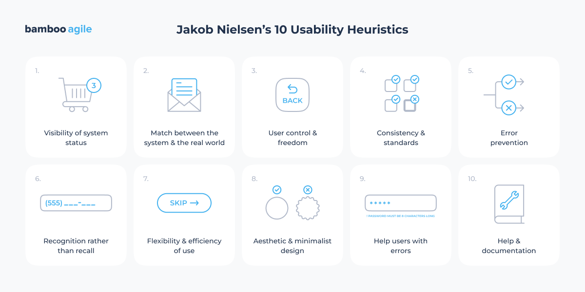
Of course, experience and a trained eye can’t be replaced by a universal checklist. But if you’d like to try analyzing your website or app on your own, I recommend starting with Jakob Nielsen’s 10 usability heuristics – they’re still very relevant today.
You mentioned that a business’s growth and changes in the target audience can signal the need for changes. With that in mind, how do you think user expectations evolve over time, necessitating a redesign?
– Users’ lifestyles are changing quite rapidly, and they’re constantly adapting to new patterns of interaction with the digital environment. That’s why a specialist keeps an eye on the dynamics and trends in this space in order to offer relevant, up-to-date solutions to their clients.
Speaking of trends, users today value speed and saving time. People now have unlimited access to massive amounts of information, and the problem is no longer finding information but its filtering and verification.
This leads to certain behavior patterns, like infinite scrolling and even watching multiple videos at the same time. People have also stopped engaging with long texts, they now read by skimming headlines. As a result, the way information was presented to capture users’ attention five years ago may no longer be effective today, and it needs to be re-evaluated.
Redesign process methodology
How do you plan the redesign process? From hypothesis delivery to implementation. Do you have a well-established methodology?
– Without a clear methodology, you risk simply wasting time. So it is crucial to use proper tools and frameworks.
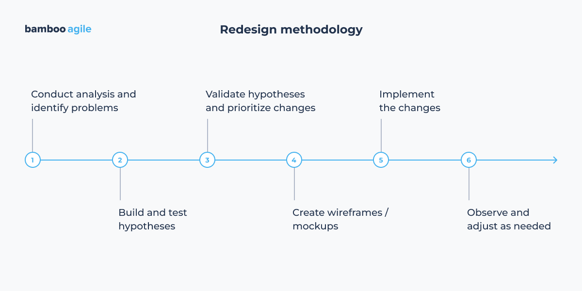
First, you need to conduct an interview with the business owner among other things. You should also analyze the product itself, identify the business’s competitors, and conduct a competitive analysis. Any desk research is also welcome. At this stage, your main goal is to understand who the target audience is and what their needs and pain points are. To gather more accurate data, user personas are created and qualitative research is conducted – primarily in-depth interviews.
In general, the essence of such user research is to identify non-obvious points about how people actually use the product. And without proper immersion in the details of the context, it is very easy to miss seemingly small things, but which will affect everything.
For example, you may find that your audience uses your product exclusively from a mobile phone, which is not the newest and most powerful, and always in a place that is not the most convenient: subway, bus stop in the rain, noisy queue at the store, etc. And at the same time, you would like to equip your functionality with a whole stack of complex interactions, so you will agree that there is a reason to reconsider your initial ideas.
Or you carefully organized your products in the online store, but it turned out that your audience would have decomposed it completely differently, so now they can’t find the necessary goods and purchase them. Remember that your picture of the world may differ significantly from the target audience’s ideas, so while researching, if not unusual, then unexpected things are always waiting for you.
Next, your research-based hypotheses are built and tested. If time and resources allow, usability testing can be conducted. Alternatively, an analysis can be done based on the specialist’s experience and tools like usability heuristics.
Once the hypotheses are validated, they’re prioritized. We decide which changes are critical and should be implemented first. Then we move on to wireframes or mockups, run tests, and if we reach satisfactory results, the updates are implemented into the product.
After launch, we observe how things perform in the real world. If needed, we go back to the hypotheses to make further adjustments. Otherwise, we move on to implementing the less critical changes that were set aside for the next iteration.
UX vs. UI redesign
What criteria do you use to separate “UX redesign needed” and “UI redesign needed”? Are there situations where visual updating without UX revision is justified?
– Sometimes, it is really enough to update only the UI part. If your business and audience haven’t changed, especially their goals and needs, then you probably don’t need major updates to your web app architecture, for example.
Here are some signs that your product needs a redesign in terms of appearance:
- outdated or unrealistic graphics, as well as an overall design style that feels obsolete – especially when compared to your competitors;
- cumbersome presentation of information;
- overloaded interfaces;
- weak emphasis on key elements;
- inconsistency with the brand (for example, if you’ve updated your visual identity, your website should reflect those changes as well).
UX issues, as I mentioned earlier, can arise from changes in your business itself: naturally, if your goals evolve, the product must be reviewed and adapted to meet new needs – either yours or those of your audience. This may lead to changes in the architecture of your project: rebuilding old sections, introducing new ones, revising mobile versions, etc. However, even if nothing changed, was everything initially well thought out at the start of the project? It is worth checking if you’ve missed something.
Your product has UX problems if your users are confused, do not find the necessary information, make mistakes, do not follow the right path to the end, do not perform targeted actions (do not buy, do not subscribe, etc.). And if users are openly complaining about usability, then there’s no need for hypotheses – the problems are clear.
Well, to conclude this topic, I would like to draw your attention to the fact that the concepts of UX and UI are closely related, and you should not try to draw a clear line between them, because UI is nothing more than a part of UX. Therefore, starting changes in one area, they are likely to affect the second one at some point, and vice versa, this is a natural process.
Working with existing systems
And how do you work with legacy – old code, patterns, styles? Is it worth breaking or adapting them?
– It is worth adapting them, but gradually and carefully. Outdated elements can be updated in several stages rather than through drastic changes. You can create a plan for such an update and lay down each stage at once. It is essential to analyze what is better to change and when.
Note how slowly the logos of well-known brands are updated: in some cases, you probably won’t notice these changes the first time, a prime example is the Coca-Cola logo. It is all the same inscription, text style, and overall impression, but if you look closely, the versions differ in subtleties.
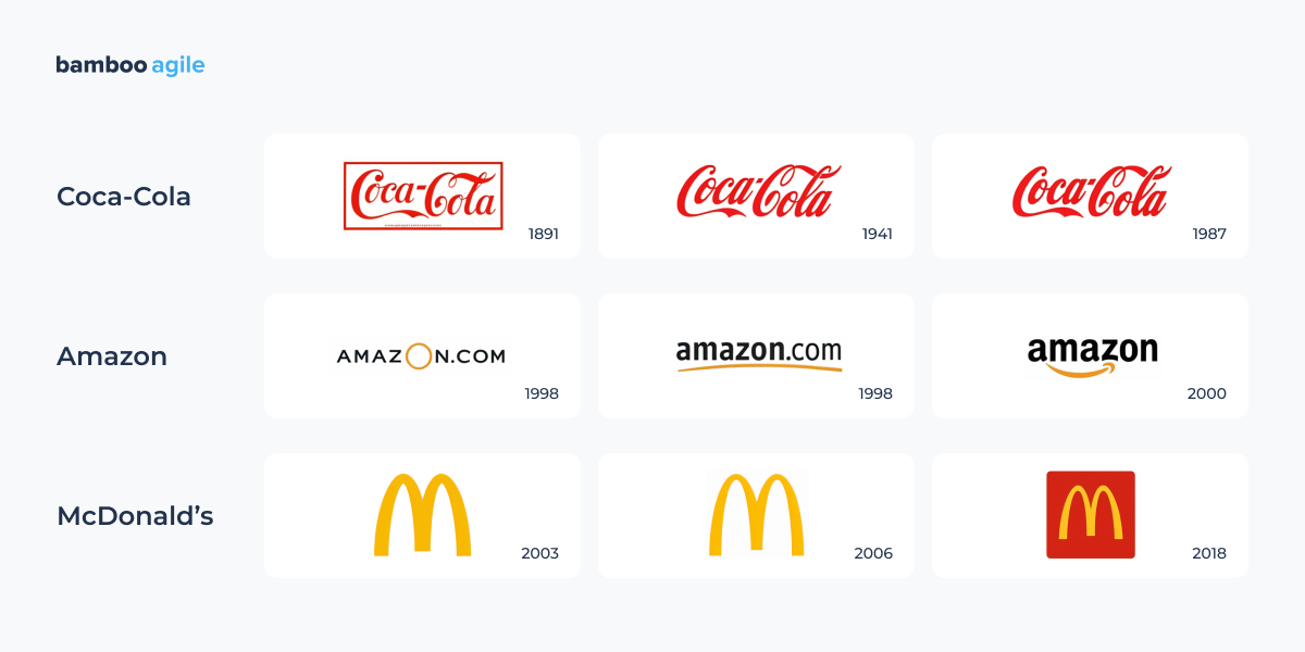
This raises the question: why make changes and spend money on them if they’re so subtle that you might not even notice them? Paradoxically, it is because you don’t notice the change. If the designers hadn’t changed the logo, it would have “aged” without these changes and wouldn’t look relevant to the time we live in. And this is exactly the case when you need to run in order to stay at the same point.
Cross-functional collaboration
How do you work with developers during a redesign? At what stage should they be involved? Were there any conflicts during the transfer of the layouts? How were they solved?
– Globally, there is nothing new in working with developers on a redesign. The principles of mutually respectful cooperation work here in the same way as on all other projects.
But there are some nuances related to the work already done: after all, a redesign is a change to what already exists, and such work can be even more difficult than creating a project from scratch. It makes sense to consult with the developers about any technical issues that have the potential to disrupt the system or create problems in it.
That is why at Bamboo Agile we involve engineers at the earliest stages of the project, starting from the requirements gathering phase. It helps to prevent the situation where the analyst and the client come up with an idea, the designer creates an appealing solution, but developers shrug their shoulders because it is technically unfeasible. As a result, this approach avoids wasting the time and money on an unrealistic concept.
The main principle of “do no harm” concerns not only the user experience but also the technical part of the project. It is also useful to consult with developers on the appropriateness of certain changes, as “potential benefit should exceed potential harm”. Conflicts are generally not professional, but discussions are a normal part of the job, they should not be a surprise to experts. The main thing is that they should be useful. For this, you need to be able to keep the focus on the subject of discussion, not on personalities, and then conflicts will be minimized.
How can QA specialists be involved in the process earlier? What can we learn from them before the start?
– It makes sense to involve QA in the work already at the stage of hypothesizing. Thanks to professional observation, they quickly understand where users may have problems. The experience of each specialist in their field is unique and should not be underestimated. Then you can really learn a lot, for example, attentiveness, objectivity, strategic and critical thinking, and the ability to think through the probabilities, especially unfavourable, like user deviations from scenarios.
Also, by involving QA at an early stage of work, you can better immerse them in the context of the project, especially this specific target audience, so you set the right work vector immediately. As a result, your collaboration with QA will gain a synergistic effect, where the dry specifics from QA complement the designer’s qualitative research and their ability to empathize, which eventually leads to a balanced result.
Post-launch evaluation
What metrics should be tracked after the release of the new design? And how long before conclusions can be drawn?
– Within a couple of weeks after the redesign, you can start analyzing: at least to see if there are any drastic changes. More meaningful conclusions can be drawn after 6-8 weeks, when the indicators stabilize and steady dynamics will already be visible.
We evaluate how user behaviour has changed, starting with quantitative metrics that show facts and figures (conversion rate, CTR of key buttons and elements, session duration, etc.) and continue with qualitative metrics that answer the question “why?” (results of usability tests, user reviews, etc.).
And it is important to remember that we evaluate metrics in the context of the specific hypothesis we’re currently working on. Without that context, the data won’t tell the full story.
Which redesign would you call successful? And how to identify an unsuccessful one?
– A successful redesign addresses a focal problem, while avoiding the occurrence of others. It means you’ve managed to carefully correct something in the “ecosystem” of the product, without disturbing it and without causing a sharp negative reaction from regular users. Ideally, this will result in attracting new users, that might lead to profit growth, successful optimization, and so on.
An unsuccessful redesign is when it hasn’t solved any problems, and the worst is when it has caused new problems. At the same time, from the perspective of a person out of context, such a redesign may seem very beautiful and modern, someone may even admire it, but it may just turn out to be a useless beautiful picture. Each redesign needs to be considered in the context of business needs first and foremost. Only then it will have a great chance of becoming successful. Therefore, everyone who is working on a redesign should first of all strive for objectivity, and judge not by the cover, but by tangible results.
Emerging UI/UX trends
What are some emerging UI/UX trends that businesses should consider?
– There is a lot to say about trends, but it is important to understand that blindly chasing them, especially short-lived ones, makes little sense. This mostly applies to visuals: ultra-trendy effects, flashy animations, loud colors, and so on.
These visual fads change quickly, often require significant resources, and, in most cases, don’t actually solve any real business problems. So, be critical and resist the temptation to decorate your website with the latest design trends like a Christmas tree – it won’t do you much good in the long run.
So, does that mean trends are useless and should be ignored? Not exactly. Any trend should be analyzed in terms of the benefits it brings. For example, dark mode helps reduce eye strain, which is especially useful if your target audience uses your product during nighttime. Or VUI (Voice User Interface) can be helpful in situations where users need to free their hands or are pressed for time. In e-Сommerce, for example, 3D models can be useful because they help potential buyers better visualize the product and view it from all angles, which can be a deciding factor leading to a purchase.
Also, pay attention to “long-term” trends: these are usually not just about visuals, but about user behavior. As mentioned earlier, users have become accustomed to fast content consumption and handling large volumes of information. This shift is reflected in trends such as micro-animations, skeleton screens, and interactive previews, all of which enhance the speed and engagement of digital experiences.
Additionally, users are increasingly multitasking, demanding interfaces that support background modes and hybrid UI elements. Over time, users have become more proficient and discerning when interacting with digital products, so now they need minimal onboarding, advanced customization options, and flexible interaction models.
Furthermore, AI assistants, including conversational chatbots and voice assistants, are now widely used, alongside AI-powered design and automation tools, and even generative UI that adapts to individual user needs.
These are behavioural trends that will likely stick around for the coming years – and they’re worth adopting in your product if you want to meet your audience’s expectations.
Redesign validation
Finally, what are the best ways to test a new design before full implementation?
– Usability testing is always a good idea, but you need to carefully select the right audience for it. The participants should resemble your potential customers, your target audience (which also needs to be properly defined beforehand, including creating a user persona).
If you’re not confident in your ability to moderate, it is better to conduct unmoderated testing to avoid accidentally influencing the results.
The fact is, you need to be sure that your moderation does not distort user behavior, because people can be very suggestible. For example, you might unintentionally ask leading questions (like “Have you tried clicking here?”), give non-verbal signals (a nod, a smirk, a sigh), etc., and eventually influence the results of this testing. Therefore, the moderator remains neutral, but at the same time friendly, objective, professional, and follows the testing script precisely. Otherwise, the participant should understand that they’re not being tested personally, but rather the interface is.
But before starting usability testing, it is important to define and filter your hypotheses. Begin with testing the most important and easiest-to-implement ones.
What could the hypotheses be? Let’s say you have an online store, and you have two hypotheses. The first one is that users don’t see the shipping information, and this may prevent them from completing the key action: making a purchase. The second is that users get lost in an overly long and unstructured product description, and as a result, they may miss some important details in the description.
Let’s figure out which of these hypotheses is more important.
In the first case, the most likely scenario is that the user will not buy the product, because they don’t understand how to get it, and they’ll leave for another website where the shipping information is clear.
In the second case, it is most likely that the user simply does not finish reading some details in the product description (it is doubtful that this will significantly affect the purchase decision, since they might already be familiar with the product, or the specific details in the description may not matter that much to them).
Thus, we can see that the first hypothesis is more important than the second in terms of business impact, because purchasing a product is a key action on the site, unlike detailed information, which plays a secondary role.
Next, we assess the complexity of implementing changes based on our hypotheses.
In the first case, to make the shipping information more visible, we can simply move it higher up on the page layout, highlight it in bold, put an icon, or highlight it in color — all these changes are easy to implement.
In the second case, we need to rework the product description: split the description by topic and add subheadings, perhaps draw some tables and diagrams, probably even rework the text and find some missing description in other sources. These changes cannot be called simple, and may take more time and effort, since the description of each product still needs to be unified in some way, because in each specific case it may contain different information.
Thus, we see that the first hypothesis is easier to implement in practice than the second one.
Basically, the first hypothesis is both more important and easier to implement than the second one, which clearly makes it a higher priority. Therefore, in this case, we should start with it. So, this was an example of the general mechanism of how prioritization works.
Key takeaways
There are a lot to think about, so let’s highlight the main insights mentioned in our interview:
For 20 years of working with different types of digital products, we have gained insights on how user behavior has evolved and what will be the most relevant and effective for you today. If you are still in two minds about whether you need a redesign or not, feel free to book a consultation with our experts.