Mobile design decisions now carry real financial weight. The global mobile app market is projected to reach $330 billion in 2026, according to Fortune Business Insights, and analysts expect it to cross $1 trillion by the mid-2030s. Money keeps flowing into apps, but user impatience keeps growing, too. AppsFlyer’s benchmarks cited in a 2025 report put the 30-day uninstall rate at 46%. Most of those removals happen on day one, before a user gets past the first screen.
These last numbers point to a pattern – a product’s interface now doubles as its retention strategy. Take, for example, the redesign of Google Gemini’s interface earlier this year, with its focus on discoverability, multimodal input, and cross-platform consistency.

Overall, a phone screen has to earn attention within seconds and hold up against dozens of competing apps a swipe away. It also has to adapt to how a person actually uses it. Consequently, design processes have to change, starting from the very first stage.
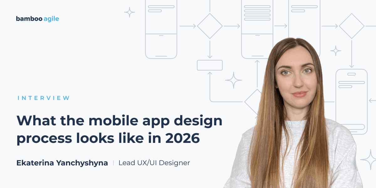
To get past the theory, we sat down with one of Bamboo Agile’s own senior designers, Ekaterina Yanchyshyna. She walks through how a real mobile app design process runs in 2026, from the first client conversation to a build ready for development, and pinpoints the place of AI in the workflow.

Our expert
Ekaterina Yanchyshyna is a Lead UX/UI Designer at Bamboo Agile. She has worked in digital product design for more than 10 years. Ekaterina focuses on creating practical interfaces and collaborates with teams across different industries to build user-centric experiences. She also has experience teaching web design at a UX design school.
Before you start
In 2026, the distinction between product designers and frontend developers has become really blurred. What is the key skill set a designer brings to a new project today?
By now, design and engineering have mostly stopped being two separate disciplines. They are blending, and I think that will keep going. That said, a product designer and a frontend developer still own different territories. The designer’s real skill is to hold user experience and business needs in the same hand and find the balance between them.
The other big change is speed. I can now spin up several design directions at once, put them in front of people, refine what works, and test again. Then we carry the strongest one forward. That loop lets me try ideas I would have talked myself out of a few years ago. I validate them in practice right away and then make decisions with actual evidence behind them instead of a hunch.
Before, collecting data, analyzing it, and designing all took so much longer. As a result, plenty of good ideas got dropped because there was no time or budget to chase them. Now, that work is just part of how I operate.
That extra room for iteration is itself part of a bigger change in how design and development relate to each other. Vercel described the emergence of design engineers – professionals who design the UI and ship the production code. Do you think that it is the future for B2B mobile work?
Honestly, I think we are seeing more groundwork laid for this every day. There is a whole wave of designers who say they should get deeper into development – and the tooling is catching up. It is getting easier for people without an engineering background to step into that space.
What I do know is that when people say “design,” they usually mean something much narrower than what is happening, like visualization. For B2B, the part that matters most comes before any of that – UX. And I see teams skip right past it in the rush to optimize. In my opinion, that is a huge mistake.
Kick-off and discovery
Since getting that early direction right matters so much, we need to ask what happens in practice once a project kicks off. Paying a vendor for two weeks of workshops and sticky notes in Miro sounds like a non-starter to most clients these days. Then, what does week one actually look like today?
The research phase has not gone anywhere. Some parts of it have sped up, sure, like anything to do with processing information from the client and other sources, market research, parts of audience research, competitor analysis, and summarizing findings. None of that necessarily needs a workshop.
I get it – clients are busy. They do not always have a free afternoon to sit in a room with us. So, a lot of the time I will send a short brief, take their answers, and run my own research from there. Then I come back with hypotheses, results, a read on the situation, and proposals. If it helps move the conversation along, I will bring early clickable prototypes too. It is easier to argue about something you can tap.
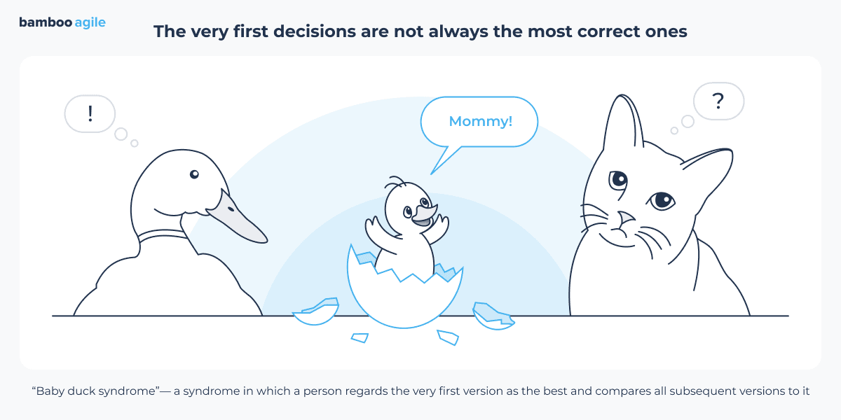
And yes, AI can handle a chunk of this now. But I want to be careful here. This approach is not always the right one. People fall for baby duck syndrome, where the first thing they see becomes the correct thing. It kills objectivity fast.
The risk of latching onto the first plausible answer and the pressure to move fast raise a question – what are the things you still insist on doing slowly during that first week – the steps you would refuse to compress no matter how hard a client may push? Can you share such a story from a project you worked on?
Well-defined project goals hold everything else up. That is not a new idea, and it will not stop being a true one.
Some research cannot be rushed, either. User interviews are the obvious example. This is a live conversation with a person, and you just cannot run a pile of good interviews in a single day. But it is still one of the best ways to understand an audience. Every so often, an interview completely changes how you see the problem. I would not wave that off.
Here is a small example from my own work. We were building an internal product, so finding interview candidates was easy. The end users were the client’s own employees. But the client wanted to move faster. He showed up with an AI-generated version of the project and wanted that iteration done by a fixed date. We finished it. He liked the visual design and presented it to his employees. However, from a UX standpoint, it did not meet their actual needs, because nobody had asked them what those needs were before design started.
Could we have avoided burning all that time and money on something the client loved and his employees could not use? Yes. What we should have done was find out what those people deal with daily. So, if there is one thing I would tell every product owner, it is this: know who your real user is, and build for them, not for yourself.
User research
Your point on setting clear goals and building for end users brings us forward. PayPal’s partnership with OpenAI now allows an AI agent to complete a purchase inside a chat, without the user ever opening the PayPal app. Suppose a B2B client asks for a similar capability. How would your research phase change to support that request? What new information about a user would you need to gather?
I think this is where audience research earns its keep. Does this audience really need a solution like this? How big is it? What will they pay? How often will they use this specific feature?
More and more people now lean on AI every day for personal tasks – it has become second nature. But new problems come with that, and trust is the most important one. You need to ask yourself if the AI really makes the best choice. Also, is a seller using AI to stack the deck in their own favor? And plenty of people genuinely enjoy picking products themselves. For them, that is part of the fun. Take that away – and you have missed something. It is an opportunity, not a problem, especially if there are a lot of these kinds of people. Which is why you study the audience and work through real usage scenarios before you build anything.

But there is a way that can help designers shortcut this stage completely. A lot has been said lately about synthetic research – running user interviews on AI agents that simulate target users instead of talking to real ones. Where do you stand on that? Have you tried it – and would you ship a design based on these results?
Interviews are live, one-on-one conversations, and that is the whole point. One job they do is to verify what we gathered earlier and check whether our hypotheses hold up. But can you verify anything about human behavior if you were not talking to real people at all, just to an AI dropped into a specific context? There is no way to confirm that real people would have answered the same way. We do research to reduce abstraction. Bringing in AI personas for that is a strange fix.
There are more obvious cases where they can still help. A simple usability test, for example, once you already know your audience well and just need to catch the glaring errors. Or you could run your interview questions through them first to weed out inaccuracies and ambiguous phrasing before you talk to real users.
Wireframing
Apple has just launched iPhone Duo, its foldable smartphone with two displays, and shared design guidelines for creating apps for the new phone. How will this change your approach to wireframes – and maybe mobile app design in general?
Foldable smartphones are not a new idea. Plenty of Android models already exist, so we have a decent read on demand. Right now it is a niche segment, and it is still unclear how Apple’s entry will change that – or whether these devices ever hit mass adoption. Let us say they do. What happens to mobile app design?
The whole appeal is a big screen in a compact body, and when you adapt an app, the trick is not to throw those advantages away. You have to know what a large screen is actually good for, in which use cases, and which apps unlock something new. Manufacturers already point developers toward the obvious ones, like two apps side by side, easier reading and document work, and a laptop mode. The rest is execution. Adapt the app well to each of those cases.
Yes, there is more work. It will take time to find best practices and refine them. But there may be some interesting discoveries along the way. We will see how it plays out.
There is a heated discussion on the r/UXDesign subreddit about whether we need wireframes in 2026. Some say: “Most of the time we just prototype something hi-fi in Figma and user test that.” Do you agree with this point, or do you prefer the classic, wireframe-first approach?
It depends on the project – I mean, complex ones usually still need wireframes. Simpler ones, especially if they are built on an existing design system, often do not. Here is the thing: a polished interface can hide mistakes in a mockup, because it pulls your attention toward itself. That is why I care so much about thinking in stages, moving from the general to the specific and back again.
Some people think low-fidelity wireframes look unprofessional. To judge them fairly, you have to understand what they are for. They let you isolate one piece of the work and focus only on that – interactivity, information architecture, layout, whatever the question is that day.
Prototyping with AI works a little differently, but wireframes still help. Even rough hand-drawn sketches do. It is just another tool, and oddly enough, it usually makes the later production work cheaper.
Prototyping
AI changing the process applies just as much to what comes after wireframing. A clickable prototype used to take weeks to build. How are you getting an interactive prototype with real, basic logic working in a matter of hours now? And what is the catch that nobody mentions?
AI is what makes this possible now. But the quality of these prototypes is still all over the place, and the problem is in how they get made. They are still generated at their core, and the system will sometimes regenerate something that was already perfectly fine. Try keeping your layouts consistent when that is happening. It gets worse on bigger, more complex projects, the ones that need more revisions along the way. Right now the whole thing feels more like a playground for messing around than a tool for serious product work. I do think it will keep getting better.
It is great, though, being able to show a concept to a team or a client in minutes. And that is where the catch shows up. A professional team sees a concept; they know there is a mountain of work left. But then the client looks at the same prototype and sees something close to a finished product, like all that is left is a few small tweaks. It is absolutely not.
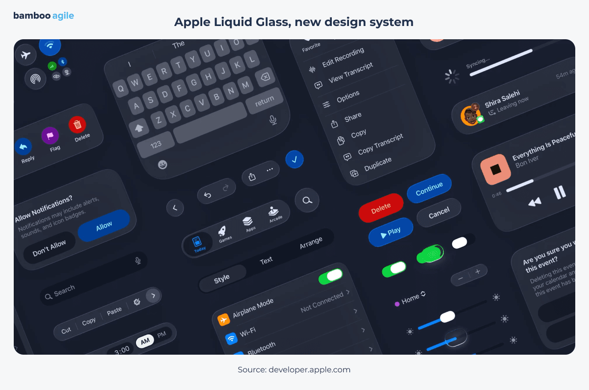
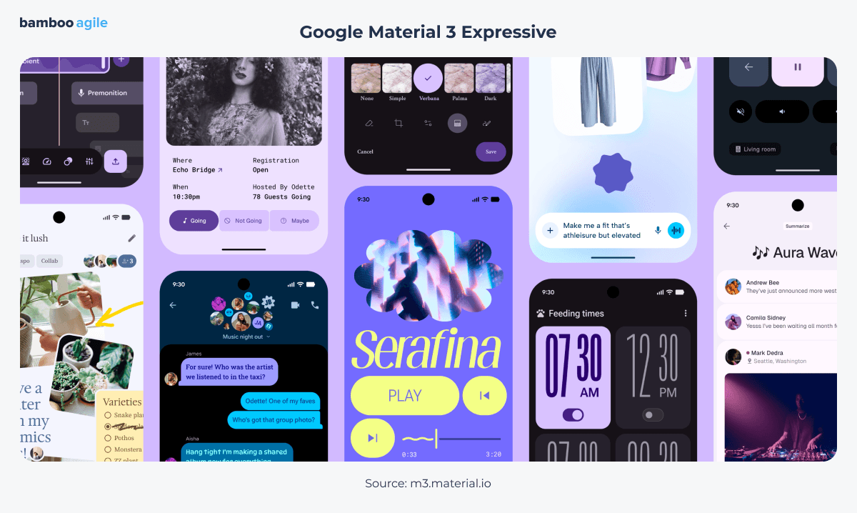
Fair point. And the gap between how a prototype looks and how finished it is gets even trickier once platform-specific styling enters the picture. Now, it is only fair to mention Google’s Material 3 Expressive update. It pushes Android toward a much more emotional, playful aesthetic – and Apple’s Liquid Glass, by contrast, stays glassier and calmer. When a client’s app has to live on both platforms, how do you prototype something that feels native to each?
Personally, I like both approaches. But clients should study their audience first and figure out what those people use most. If it is mostly Android, a cross-platform app is better off staying neutral, with no glass effects. That audience is not tied to Apple’s ecosystem; thus, there is no reason to drag in styling that belongs to it. Same goes for products where their own brand identity matters more than following trends, like strict banking apps or something with an eco-focused positioning.
With Apple’s Liquid Glass, you have a decision to make. Do you keep one consistent glass style across the cross-platform version, knowing it comes with its own nuances and headaches? Or do you build two separate versions for the two platforms? Unlike with Material, there is no clear answer here yet. You have to work it out product by product.
Developer handoff
Once those case-by-case styling decisions are made, they still have to survive the move from design file to shipped product. Figma’s 2025 State of Design survey found that 92% of designers and 91% of developers still think handoff is broken. Separately, research on product-team misalignment shows that design errors and information lost at handoff account for 68% of rework costs on a project. So, what is the specific thing that keeps getting lost in translation on your projects?
I try never to lose anything when I hand off designs. At the same time, nobody sets out to lose something on purpose. But no process is perfect, and some non-obvious element states really do fall through the cracks. Usually those get sorted out fast by talking to the developers.
One more thing I would stress – when you hand off materials, explain the value behind your decisions. Developers often just do not have the context to see why a particular detail in the design is worth building with such precision. And designers need to be honest about how much those debatable details really move the project’s metrics. If a simpler, cheaper implementation will not hurt the client’s potential and actual revenue, go with that on purpose.
AI in the workflow
Knowing when a shortcut is fine and when it is not comes up constantly with clients and AI, which brings us to the elephant in the room. What is the biggest AI-inspired illusion clients walk in with in 2026 – the “design in one click” fantasy or the belief that “AI will just handle it”? What does that conversation sound like when you push back?
In reality, AI is a good additional tool in a professional’s hands. It speeds up certain stages, yes. But everything tends toward balance – wherever something speeds up, something else slows down. That first burst of speed usually just hides a slowdown that shows up later, as a pile of iterations and revisions. In the end, it takes almost as much time and effort as the usual process.
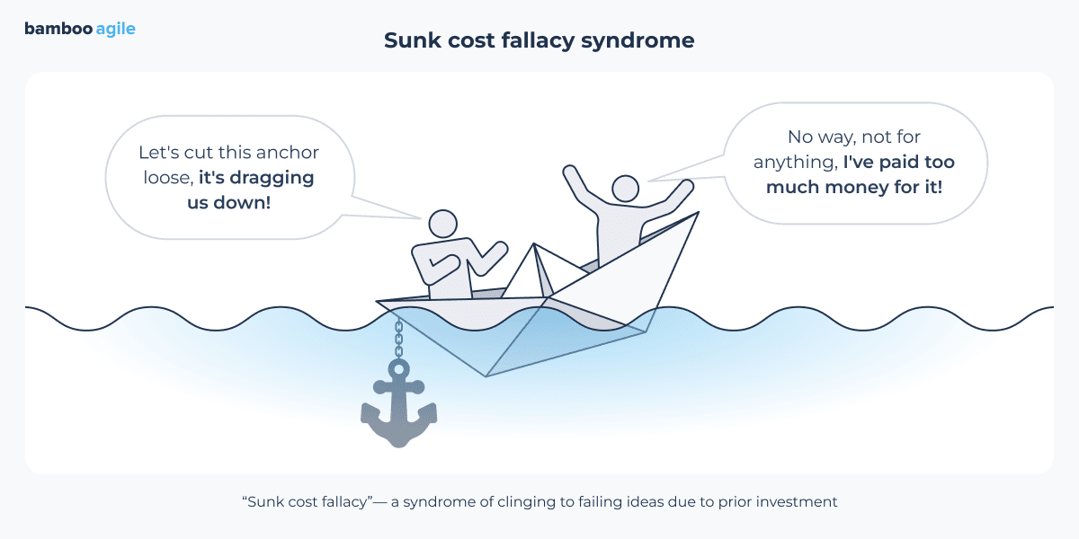
I am sure plenty of clients have already tried it themselves and learned firsthand that it is not as simple as it looks, and there is no magic. That is exactly why they come to teams in droves asking for help finishing what they started. But often the client, working alongside AI, was headed the wrong way from the start, and the work has to begin from scratch. By then it is extremely hard to convince them of that. They have fallen into the sunk cost fallacy and will not let go of the effort they have already put in.
Research, gathering information, fact-based decisions – none of that is an empty bureaucratic ritual. These are the things that separate good design from throwing screens together at random and hoping something works. Clients working with AI models usually skip this stage entirely.
Beyond client expectations, there is also a more visible, output-level problem with artificial intelligence. When AI can generate a clean, competent layout in seconds, everyone’s interfaces start looking the same. How do you avoid that sameness? Where does the generative algorithm’s job end, and where does actual hand-crafted input begin?
AI can give you a decent baseline that a designer then develops further, and this is the most flexible way to fight the sameness you mention. Of course, you can keep refining your prompt. You might even land on some interesting ideas along the way. But like anything involving AI, all of it has to pass through a professional eye. The digital space keeps getting more crowded, and standing out means looking different from everyone else.
None of this matters without the target audience in mind, though. The whole point is for them to notice and appreciate it, not just anyone. I would also say identical-looking interfaces are not automatically a bad thing. A lot of the time, that consistency helps users find their footing in a new product fast, which means they get their tasks done more effectively. It is good for the business too.
With this in mind, we should get concrete about where AI pulls its weight in mobile design and where it does not. Now, give us three specific stages in mobile design where AI has genuinely cut the grunt work by something like five times over. Then, can you outline one area where it remains completely useless to you?
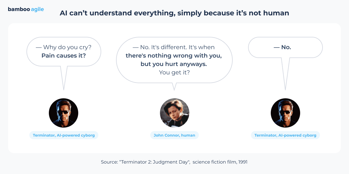
Gathering and analyzing information, generating ideas, building the basic logic. Maybe not a reliable five-fold speedup, but it definitely cuts things down. Everything else you still do yourself. AI will not run your user interviews. It also will not draw the right conclusions or show empathy. Those are its weakest points, simply because it is not human.
Yes, AI still cannot replicate empathy or human judgment, which makes it worth testing that limitation against one of the more ambitious ideas circulating right now. Nielsen Norman Group has been writing about Generative UI – interfaces assembled per-user in real time by AI, rather than designed once and shipped as fixed screens. Do you buy that shift? Or does the idea break down for B2B products, where compliance and consistency are non-negotiable?
Personalization is not new. Designers have been building different sections, blocks, and scenarios into product logic for different audiences for years. It works, but it takes care. The version being proposed here leans on user habits, data the user has shared, their digital footprint – that kind of thing. Real life is messier. There is no guarantee all the data tied to one account belongs to one person. Kids use their parents’ phones. People book flights for someone else.
The classic approach dodges this by keeping the interface static. The user picks what works for them today. Tomorrow their goals might be completely different, but the control stays in their hands. And remember, a persona was never meant to represent a real person. It is an abstract image built around the goals of a group, and a living person’s goals can shift fast.
If we are being honest here, has AI made any part of your day-to-day work worse, slower, or more frustrating?
Not directly. At the end of the day, I am the one responsible for my work, not the AI. Figuring out how to use it and whether it truly helps is on me. Any tool takes skill, and more than that, it takes realistic expectations about what it will do for you. That said, the emergence of AI has changed things. The user experience is shifting. People use the internet and products differently now.
If there is a downside, it is this: client expectations around turnaround times have grown much faster than AI can cover all the stages of the workflow. But I think that will fade into the background eventually, along with the general hype around AI as a topic.
Design tools to use now
Speaking of hype fading into the background, it is worth checking in on how much the AI conversation has changed the tools you reach for. At Bamboo Agile, your tool of choice is Figma. Throughout 2026, Figma’s stock has swung wildly, largely on fear that AI-native tools like Anthropic’s Claude Design could cut designers out of the workflow entirely. Has any of that boardroom drama changed what is open on your screen day to day?
No, nothing dramatic has changed so far. But I think it could go that way. Those of us who started out in the Photoshop era have already been through something like this, so we know it is a realistic scenario. I do not buy the idea that designers get cut out of the process entirely. But the profession will change, no doubt about it. And honestly? That does not scare me at all.
Advice for clients starting their projects in 2026
Your calm, long-view attitude seems like a good note to close on. If a B2B founder is about to kick off a mobile app project this year, what is the one thing you wish they understood before the first call, design-wise?
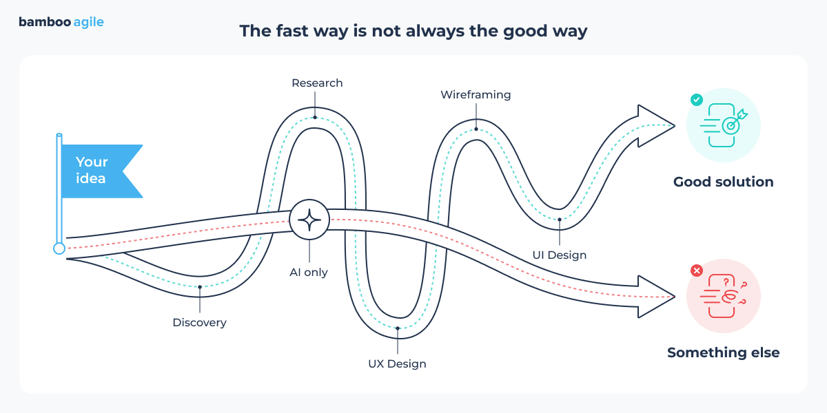
The fastest path is not always the best path. Mistakes made at the design stage do not disappear if nobody catches them. They get carried straight into production, where fixing them costs a lot more. So protect your budget, plan properly, and do not skip the research that matters for your business.